Rebranding Plansmith
Abstract
Plansmith is 45-year-old company offering innovative strategic planning performance platforms and services for community banks and credit unions. I lead a complete brand identity redesign for the company.
Credits
Creative Direction: JP Ramirez
Design: Drue McCurdy, JP Ramirez
Agency: Torque Digital
Overview and Audience
Plansmith is a leading producer of financial strategy and analytics platforms for community banks (small to midsize local or neighborhood banks). Coinciding with the launch of a new suite of tools, I lead a brand identity redesign project to reflect where the company is and is going. Through research interviews with key company stakeholders, we quickly discovered what was important to both the company's growth and their mindset of how they were to get there. Through an audience and competitor analysis, we understood the target audience would be "younger" banks that challenged the norms of the community banking industry. This positioning lead us to think about the company in a new and drastically different way than before.
Name and Values
The name "Plansmith" implied a specialist in planning, someone who was dedicated to mitigating risk in a chaotic financial environment. Our team felt this name matched the vigor of both the company and the target audience, so we opted to keep it for its energy and heritage. From discussions with the client about the passion they bring to the normally mundane industry of bank finance, we crafted a mission statement: "Plansmith champions the use of an effective planning process to put companies on the path to sustained quality earnings—accomplished by bringing objectivity, creativity, and horsepower to the entire process."
Then we developed the brand values:
- Champion our Mission: We are inspired by what our company stands for, and are committed to achieving our vision for the future of financial planning.
- Simplify Complexity: We believe simplicity drives clarity, insight and better decisions. Everything we do is in an effort to make concepts understandable and our products intuitive and easy-to-use.
- Nurture an Entrepreneurial Spirit: We challenge the status quo, embrace change, and actively search out and test new ideas to craft the best products possible.
These were to serve as our emotional and strategic reference points to inform our visual development.
Auditing the existing brand
After we aligned who the company was, and where we were going together, we began a rigorous "brand audit" for all existing graphic and visual assets the company had—documenting current uses, advantages, and disadvantages, and missing pieces of the visual library.
Extremely horizontal logo caused formatting issues depending on media platform.
Iconography audit concluded with a myriad of styles used inconsistently.
Alt logo in a massive badge...
Script felt a little out of place
Think these are banners.
From our audit, as to be expected, we found there were lots of inconsistancies in both the style and use of graphic elements. The brand had a lot of channels, but mainly web and digital components were going to be a focus.
Beginning Ideation
We began to explore aesthetics, visual concepts, and design elements by creating mood boards for stylistic directions we felt were relevant to the brand values. This included brainstorming an exhaustive list of descriptors for the brand, then symbols for each descriptor to provide visual areas to explore—or what I like to call "creative fuel." This served as a visual foundation to begin sketching and making.
Honing to One Direction
Though our process explored a number of different styles and symbols, we agreed that three overarching concepts felt the strongest to pursue. Upon reviewing with the client, one direction was unanimously voted as extremely accurate to the brand, both in symbolism and form.
In my 27 years of being here, I've never seen our company make a decision this fast, you get us!
—Craig, Plansmith CEO
Given Plansmith's intense passionate about the next step forward for community banking, and that strategic decisions only took a spark of creative insight from well-presented data, the idea of a match striking to a flame felt like the symbol the company was looking for.
Our final execution of the mark played on the idea of a match striking, with subtle refinements to symbolize financial data growth. The "P" mark was to represent an abstracted match head on fire, while the flame also was an upward-trending arrow to symbolize forward movement and growth.
Construction
The mark was developed based on a modular system of proportionate squares and circles. This provided the mark with a clean geometric style that we felt worked well with the brand value of "simplifying complexity." Typographically, Grilli Type's grotesque GT America in a bold weight was a modern and sturdy way to imply stability in bank strategy. To give a nod to the mark, a subtle sloping edge was cut into the dot of the "i", "t", and "h".
a Sublogo system
Once the brand logo was finalized, we had to take into account the products that fell underneath the overarching brand. There were a total of 6 products that needed logos for their updated platforms. In order to match the look and feel of the "match" mark, we developed a grid system based on the core mark's geometric construction. From there, symbols relating to the respective product names were built using the underlying shape components. GT America was again used for the supporting logos, though this time utilizing a regular and bold weight of the compressed width series.
Compass needle symbol, GPS/Wifi signal symbol constructed from original Plansmith logo grid.
Color
A competitor analysis during our research showed that there was a slight dominance of blue tones, but otherwise there was no heavy lean to one side of the spectrum. To reference the blazing strike of a match, and burning passion of the Plansmith team, a red-orange was the final selected main color from which we built a system around. For the product logos, we chose colors that matched the intensity of the core Plansmith logo to build out a spectrum.
Texture, Pattern, Photography
An atmospheric photography set was developed to build out the brand kit and aid design of subsequent materials. We chose a set of ethereal embers from a fire floating in the air. This felt like a strong concept to tie back to our manifesto of flames and sparks. As a rule though, the photography was limited to the sparks in air, and not flames. The spark represents a piece of knowledge that could spark a new idea, never underestimate a spark's ability to start a full blaze.
Graphic system
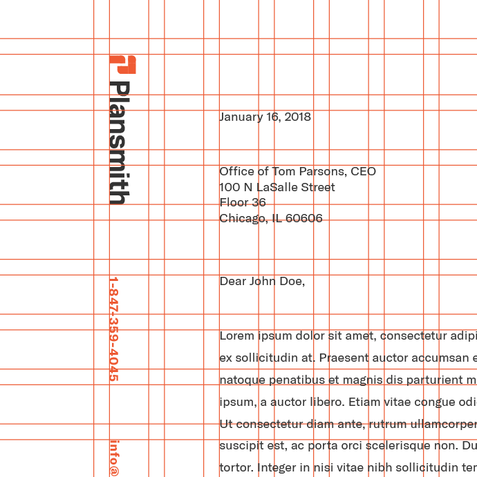
The same grid structure used to generate the sublogo marks is applied to the graphic system for the initial branding materials and stationary.
Underlying grid detail based on logo construction system


