University of Illinois Master of Fine Arts Identity
Abstract
I was asked by the University of Illinois (Urbana / Champaign) School of Art + Design to develop an identity system for the Master of Fine Arts program and the 2018 MFA Exhibition. Our process yielded a modular graphic system that affords endless variability in how the institution expresses itself and showcases its students' work across every medium. The deliverables are distributed world-wide to other institutions, prospective faculty + students, and creative professionals.
Credits
Client: University of Illinois College of Fine + Applied Arts
Creative Direction, Design: JP Ramirez
Printing: Premier, Classic Color
Concept
The University of Illinois School of Art + Design offers a world-class Masters of Fine Arts Program gives its students an unprecedented learning experience. Each student has the ability to make themselves into the artist, designer, or title they want to be using all of the resources at hand. The vision for this identity quite literally builds itself off of this premise. The resources the program provides are interpreted as visual building blocks, and the way the students uniquely use those resources is interpreted as a modular approach to the program's identity and design layouts. No two experiences are the same—and by design, neither are the pieces in the branding system.
Typography
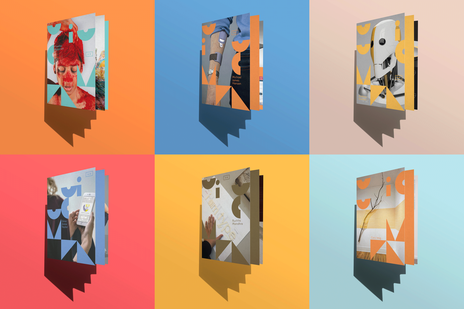
A custom typeface was created for the identity system. It bases itself off of hyper-simple shapes that can be interpreted as the resources offered by the University of Illinois Art + Design MFA program. I imagined asking a group of students, "how would each letter be created and standardized with as few shapes as possible?" Perhaps the shapes could be bent, cut, adhered, etc. This inquiry yielded a cohesive set of letters to serve as the foundational building blocks for the design system. In editorial contexts, the custom typeface also functions as drop capitol letters, which are then placed along the modular grid around content.
Modular Grid System
A modular grid system was a necessity to the project, in that the institution needed the ability to showcase student work. Strategically, the design system is a means to the student's works' end, and accordingly the system should respond to—and respect—the work. Given this premise, a variable modular grid was developed that divides the dimensions of the given medium into columns and rows that create square cells. The letter-shapes of the system can arrange themselves, in any way afforded by the grid, to minimize intrusion into important points to the student work.
Color
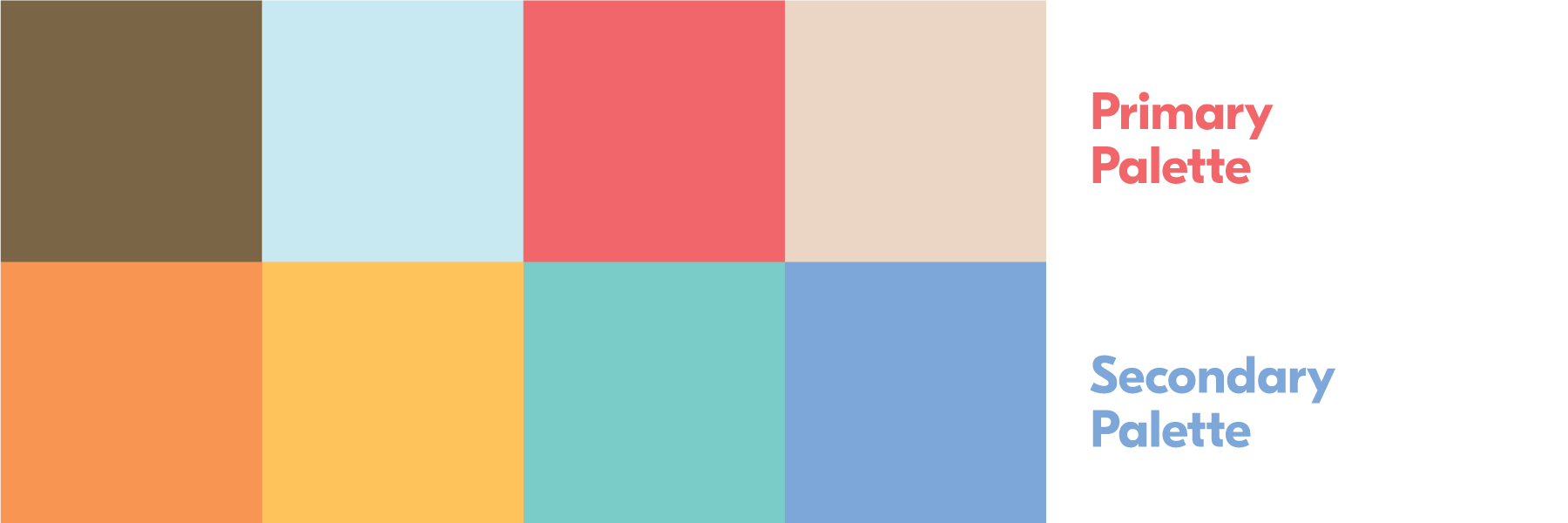
A playful, primary palette felt appropriate based on the program ideas of experimentation and foundational building blocks. A spectrum of colors was pulled from existing student work, allowing for at least one swatch that could contrast, recede, or harmonize over any image, depending on intent.


